By Chevonne, Leap’s Junior Sustainability Designer
Joining Leap as an aspirational young design graduate, I was unsure what to expect being new to the creative industry. However, the amazing Leap team gave me the warmest of welcomes and helped me to settle into my new role as a junior designer. My time with Leap has already taught me so much, having been given the opportunity to work collaboratively on a variety of projects; from brand to website design, and everything in-between. I can’t wait keep exploring the endless creative possibilities that design has to offer!
As part of my personal development plan (PDP), I was given design lead on my first client project with Hidden Scars. Hidden Scars is a solution-based organisation, whose mission is to raise awareness and help people find peace and forgiveness from past traumatic life experiences – both physical and mental. Hidden Scars focuses on ‘the power of healing, the power of letting go.’ It’s an extremely powerful organisation, tackling unspoken issues that need to be addressed within our society, and was therefore chosen as one of Leap’s Grant for Good recipients.
We began the project with a discovery workshop where I met Bethel for the first time (virtually). Here I gained a greater understanding of Hidden Scars’ purpose and ambitions. The workshop was vital in highlighting key information, such as Hidden Scars’ values of forgiveness, compassion, love and respect. It was clear to see that Hidden Scars is an inspiring and powerful organisation, with strong values and an overarching goal to support and help people. It was therefore imperative that these were represented throughout the brand design.
It is well known that issues surrounding abuse and mental health are often unspoken and stigmatised within our society, often being brushed under the rug in the hope that they’ll be forgotten. Hidden Scars tackles these issues head-on, not only to raise awareness but also to find solutions, helping people through the processes of healing to ultimately find forgiveness. Before working on any concept designs, it was important that I understood the tone of voice that Bethel wanted to use for her audience, especially as she would be addressing some very personal and emotional subjects with them. It is vital that people feel safe and open to share their personal stories with Hidden Scars, thus it was extremely important that the design didn’t feel sombre and downbeat, but rather, uplifting, exciting and accessible.
“People should feel inspired and excited about the possibility of forgiving and how that could change their life for the better, to almost feel infected by the joy and peace forgiveness has brought others and can bring them. The first contact with Hidden Scars should lead people to think ‘wow, I never realised forgiveness was so powerful, maybe I should do that for myself’.”
-Bethel Tadesse
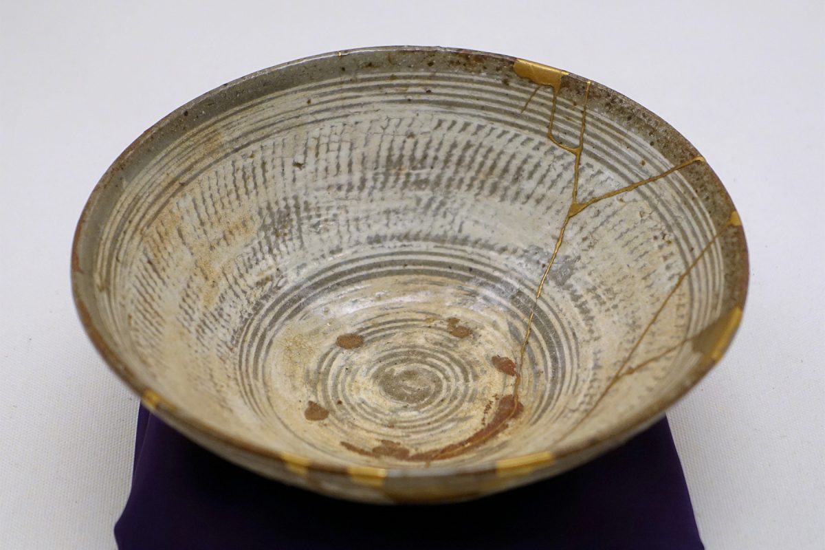
When working on the concept development for the logo design, one thing in particular that Bethel had brought to my attention was the Japanese practice of kintsukuroi, which means “golden repair” (it’s also often called kintsugi, or golden joinery). Kintsukuroi, is the craft of repairing broken ceramics or pottery with a lacquer mixed with gold dust, so that the repair is beautiful and comes to be celebrated rather than hidden. Kintsukuroi, like the philosophy of wabi-sabi, is about accepting the wear and tear of life and shows that by embracing flaws and imperfections you can create even stronger, more beautiful objects that are now pieces of art.
In the case of Hidden Scars, through healing we can become stronger and even more beautiful human beings. This was something that I couldn’t ignore and I knew that I had to reflect it within the logo design. I did so by taking cut-out sections from the Hidden Scars logo type, which were then pieced together to create a heart icon representing self-love, one of Hidden Scars’ key values. This concept highlights peoples’ scars, not as something to hold them back but as the thing that makes them stronger and more resilient. I can happily say that both Bethel and I were extremely pleased with the visual outcome, but more importantly, with the powerful messaging it holds within it.
As an extension of my PDP, I also used Hidden Scars as an opportunity to further develop my skills in animation. I transformed the Hidden Scars logo into a short animation, highlighting the brand identity and reinforcing the concept of embracing your flaws and becoming more beautiful.
This whole project has been a wonderful development process for me, not just as a designer but personally. Taking lead on my first project and working with a client first-hand was really rewarding and a great learning opportunity. Public speaking has always been something that I have found quite daunting, however the experience was made so much easier knowing I had the whole team’s support behind me. I have enjoyed every second of this project and look forward to exploring new and innovative ideas with the team in our next projects.