Harbour Housing are an amazing and award-winning Cornish charity working to change the lives of the South West’s most vulnerable people for the better, and end homelessness. They run a number of projects that they tailor to user’s needs, all with the ultimate aim of helping people who are either homeless or at risk of becoming homeless, to transform their lives and live independently. These range from outreach services to prevent people from becoming homeless in the first place, through to supported accommodation, cold weather provision and specialist accommodation services for victims of domestic violence or for people about to be discharged from hospital who have no home to return to.
Last year the team at Harbour decided that they were in need of a rebrand, to better convey their values and streamline their messaging.
“We’d felt for a while that our previous logo, a roof symbol, focussed too much on the accommodation side of what we do, and was not representative of our numerous other ongoing projects such as outreach, hospital discharge and women’s services.”
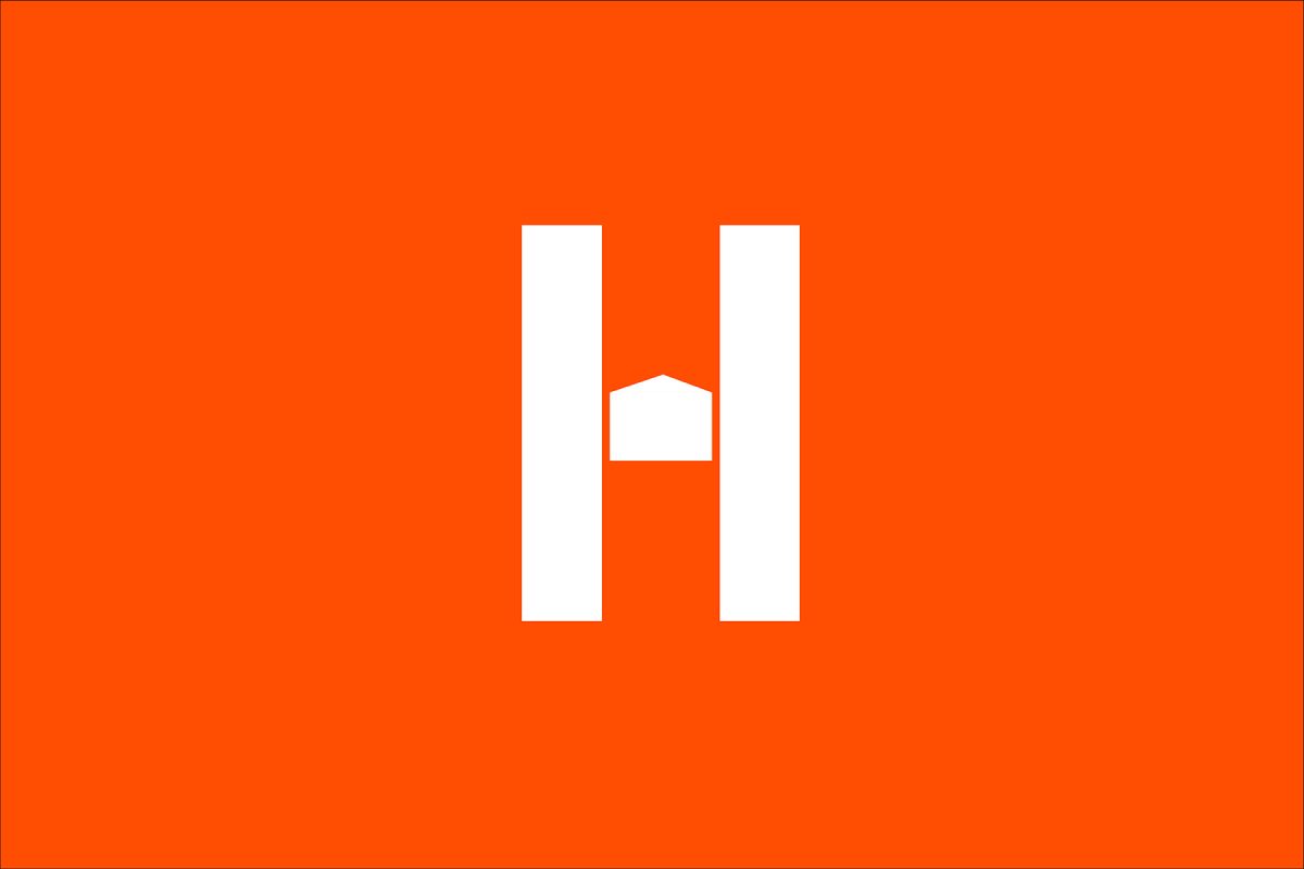
We worked with Harbour to dig deep into the organisation’s core principles and use these as the base on which we’d build their new brand. We created a new mark that uses a small house shape as the crossbar between the two vertical stems of the capital H at the start of both Harbour and Housing. The icon is a literal representation of how Harbour Housing bridge the gap and provide a pathway for people to move out of homelessness and into independent living. It also represents a safe place, with the house cushioned by the two stems on either side. We selected orange as their primary colour, alongside white and a dark blue for monochrome-esque simplicity and accessibility; orange represents optimism, strength, vibrancy, and honesty – principles at the very core of Harbour Housing.
“In terms of design, we really wanted to visually highlight what Harbour Housing are doing – especially given that they are quite different to a lot of other charities concerning homelessness. They have this ‘elastic-tolerance’, which means you can come as you are, with your own problems or addictions, and the idea is that when you can get yourself a space to call home, you can then look at addressing other areas of your life. In a lot of ways HH help to bridge the gap, not just with providing temporary housing, but bridging the gaps by providing health assistance, counselling and a lot of other things too. With the design we put the house in between the two marks of the H. This was to showcase the bridging the gap, and that they are a step in building towards a better future. Colour wise, the orange is bright and vibrant – teetering the line of hope and change, whilst the blue represents safety, comfort and peace. We wanted to encapsulate all the positive and incredible work HH do by giving them a brand that stands out and is easily recognisable, but most importantly is a visual beacon of hope for bridging the gap for those in, and coming out of, homelessness.”
Jessie Herbert, Leap junior sustainability designer